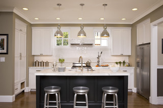
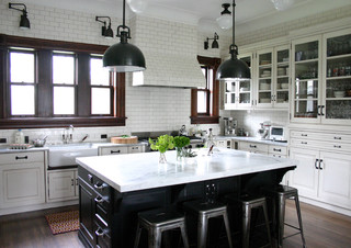
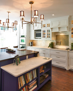
Ive been doing a lot of kitchen stalking of late & I really find myself being drawn to the kitchens with a contrasting coloured island.
Ive always been a real matchy matchy kind of girl & since blogging & studying interior design I have learnt that matching everything to perfection is NOT the way to go, unless you want your house to look more like a catalogue, than an inviting home.
I'm wondering if I can take myself further out of my comfort zone & change my kitchen plan in the dream house, to include a contrasting colour for the kitchen island....mmmmm.... take a look at these gorgeous kitchens.
Kitchen by Candace Olsen
source unknown
via cococozy
Source unknown
source unknown
They really do lift the room, in a very stylish way.
What do you think, is this a trend to stay & would you, or, have you painted or installed an island bench in a contrasting colour???
CHEERS
Trish xxx


20 comments:
You are right! I am a matchy-match girl but a contrasting island does look more inviting. Not keen on the dark brown ones and the classic part of me sees 'mission brown' (child of the late 70s/80s). How are the house plans coming along?
I too have been kitchen stalking the last few weeks too Trish! I always liked the matching island look, but you may have just shown me a couple of pictures that might just change my mind. Love the first two images with the black and white.
Enjoy your weekend :)
It does look tres chic with the contrasting colour doesn't it! Hmmm.... I am also matchy matchy so I don't know if I'd have the guts to but I think if you had lights and fittings that tied it in like the second pic then it wouldn't date or anything. Ooooo can't wait to see what you decide!!!
Jxx
Hi Trish, I love the first two images..love the black island bench..gorgeoussss. I think it gives the kitchen depth. I'm also very keen on those industrial looking stools....great images :0 X
hey lovely trish......i say do it do it, i'm with you about the display home look, mix it up a bit, [in saying that] i think when we decorate it needs to reflect who you are and both ways matchy matchy or a bit out there can look good if done properly......i'm excited to see what option you go for
love the pics xx
Oh yes I like it, I'm currently planning a new kitchen for my new home, I am not certain yet if I will go for two different colours. I want clean units and a wood effect worktop. Not sure about my island yet. Thanks for sharing all these lovely images
All things nice...
You had me at hello with that 1st picture! I definitely love the contrast and it can balance the warmth and coolness so well. I love the twist the pic gives of a traditional look but with the contrasting color and those posh stools...it puts the pic into a whole new frame of mind.
Cheers~
e
Yes I really like it! And if you grow tired of it, yo can always paint it to match your cabinets, right?
xo Linda
I love the contrasting island look, really breaks it all up and gives a kitchen more interest, thanks for the inspiration!
*Sighhhh* I can only dream. I love kitchen no 2 the best. I just want a pantry and dishwasher at the stage, but have to wait til we get our new kitchen later in the year. :(
Megs x
Hi Trish, those kitchens look stunning. Love them all.
Hi trish, lovely kitchens, cant look too much or it makes me want to renovate!!! or rebuild with a new lovely kitchen!!!
Hope you are safe and well,
laura xx
Hi Trish, I think a contrast is the way to go - especially as this house is for you and not being built for sale. I love the charcoal contrasts going on.
Had a great time catching up on your blog posts - love seeing your pics with the new camera.
Michelle
The first kitchen remodel we did was with a blue black island surrounded by white cabinets...that was 15 years ago and it would still be "in." I like the color of our latest kitchen, if you want to check it out.
Mary Ann
Love these photos. I have been drawling over a white kitchen with Jarrah bench tops, like the contrast. G
I love a contrasting color on a kitchen island. I hope it won't seem "trendy" later. I guess it can always be painted over!
Warmly, Michelle
Hey Trish,
I just found you through the winding path of the blogosphere. Hi! I have no home of my own right now but have spent a lot of time dreaming and I think I want an island in a different color than my cabinets. I love the islands that mimic or really are older pieces of furniture converted to an island. Especially as I am pretty petite (not quite 5'1") and I'd love my island to be slightly shorter than the standard height of most cabinets and countertops. It would make baking much easier.
Hi Trish I totally agree the contrast of the different colours and textures in the kitchen looks fabulous. I also love to to use the material used on the kitchen island on overhead cabinets or shelves to add some balance. Gorgeous pictures:)
I think the contrast is so pretty. We just purchased a vintage piece of furniture and are having it painted and distressed - actually it was just finished - we are going to use it as our center island. I'm so nervous to see it, but the shop owner said it is the only piece that she has ever sold that she wishes she didn't sell and that she loves the color I chose. We are supposed to pick it up this week. Fingers are crossed!
I'm having exactly the same dilemma - what did you decide? I just love the simplicity and elegance of all white kitchen with marble tops, but the more I see them the more I'm loving the look and uniqueness of contrasting colours, particularly with the island. Not sure I am going to do the dark timber, although I love the look, but our space is small and narrow so think I can't afford to add something big and dark. I'm tending towards a light grey, to pick up the grey in the marble. You?
Post a Comment